


Scale / Texture / Colour
- Admin
- Oct 30, 2016
- 3 min read
Scale
Many projects are designed to be available on many scales. For example, films can be viewed in a large auditorium or on a mobile screen. Logos can be blown up but still be recognisable in a smaller format. Many projects are also built for one purpose and format so can have as little or as much detail as is possible for that particular scale.
“Scale can be considered both objectively and subjectively”. In objective terms, scale refers to a literal dimension of an object e.g. Printed maps have an exact scale. Scale models recreate relationships found in full scale objects.
Objectively, scale refers to one’s impression of an objects size. Scale can depend on our size, as well as our positioning. Our previous impression of an object, for example an a4 book, gives us a reference point in which to compare other book’s scale. “We can also say an Image or representation “lacks scale” when it has no cues that connect it to lived experience, giving it a physical identity.” A design with similar elements can often feel very dull, with no contrasts in size, shape and positioning.
Designers are often unpleased when they get their works printed. Many entities of typeface and visual objects can look clear and crisp on screen but when printed can feel dull and flat. For example, a font size of 11 can look clear on screen but very tiny, and uninviting when viewed in the print format. “Developing sensitivity to scale is an ongoing process for every designer”.
Scale is a verb; to scale a graphic element is to change its dimensions.
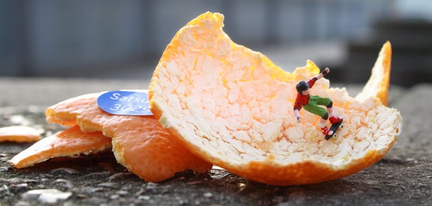
Below is an example of scale used within photography. The photographer is Slinkachu, who captures action figures in life like situations.


Texture
“Textures in our environment help us understand the nature of things; rose bushes have sharp thorns to protect the delicate flowers they surround”.
When used within design, textures are used to fit the criteria of their function. For example, a spa brochure will use an elegant, smoothly patterned surface, representing the clean, relaxing themes seen within the spa.
In design, texture is both physical and virtual. A printed piece or physical object can have a definitive texture, that one can reach out and feel. Paper can be rough, smooth, matte or glossy. These textures can make a piece feel heavy or light, giving it a sense of value. It can also affect how the consumer views certain images or typefaces, whether the light catches on a glossy letter or looks soft in a matte finish. “texture adds details to an image, providing an overall surface quality as well as rewarding the eye when viewed up close”.
Designers often juxtapose textures for contrast: smooth/fuzzy, sticky/dry, prickly/soft. “By placing one texture in relation to its opposite, or a smart counterpart, the designer can amplify the unique formal properties of each one.”

Above, is an example of Surface Manipulation. The type reflects the active processes shown in the word.
Below, is an example of Physical and Virtual texture. Digital cameras are used to capture a natural texture in objects and nature. The designer then writes a descriptive paragraph, describing their image, and the texture within it. They then create a virtual texture, using their descriptive text as content.


Colour
"Colour can convey a mood, describe reality, or codify information. Words like "gloomy", "drab" and "glittering" each bring to mind a general climate of colours, a palette of relationships"
Designers use colour to bring in the eye, to attract and subtract the viewer to different design elements within their project, whichever form that my take. Graphic design was once seen as a fundamentally monochrome enterprise. Colour has now become an integral part of the design process. With an infinite number of hues available, adding colour has become the every day, the norm within the modern process. It is no longer considered a luxury.
Colours hold deep meaning in very society. For example, white signals viginity and purity in western society but is the colour of death in Eastern societies. Colours also go in and out of fashion, alike most design elements.
Below is a colour wheel. This basic map shows the relationships between colours. Children learn to mix colours based on this model and artists use it for working with pigments.

Primary Colours: Red, yellow, blue
Secondary Colours: Orange, purple, green (two primaries mixed together)
Tertiary Colours: Red, orange, yellow green (one primary, one secondary)
Complements: Red/green, blue/orange, yellow/purple
Analogous Colours: Built from hues that sit near to each other on the wheel


Comments