Main Design: Part Two
- Dec 8, 2016
- 1 min read


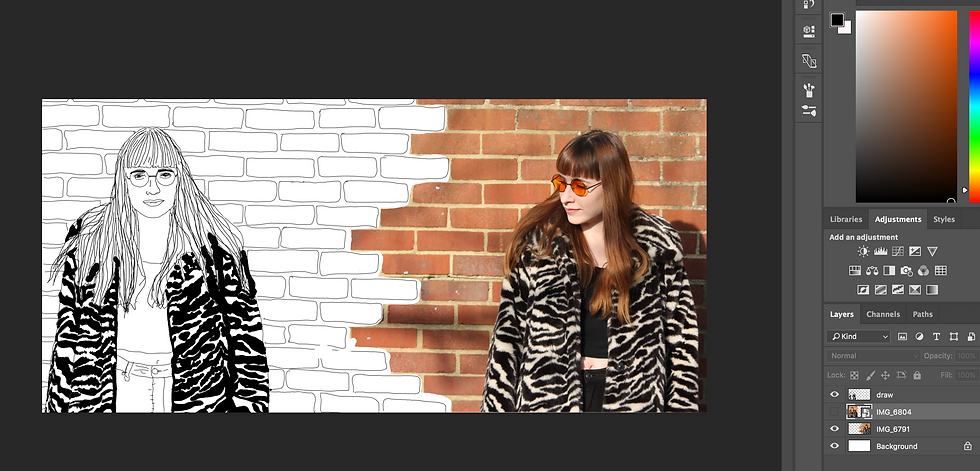
Above are two screengrabs from my design process.
To begin stage 2, I lined up two of the images from the shoot - The first being the one I have drawn around. I then inserted the drawing over the top of the layer.
To merge the two styles I erased different bricks in the second photograph, I then drew them on the opposite layer.
To continue this design I will create a conference logo that I will place into the middle of the two characters. I also want to add more colour, potentially through paint style strokes, placed behind the logo.
Below is a quick doodle I drew on the train, of a brief idea of what I wanted the design above to look like.

Comments